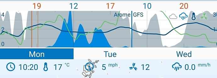
I’d love to have an option to see day and night shaded differently in the Monkeys Wedding chart. Clear nights and clear days look the same at the moment, so it’s hard to see when we’ll get actual sunshine; currently we have to scroll through each day to see what time each clear sky is. Shading clear nights some shade of blue would fix that.
Mmmmm… I’m no coder, but I imagine that this would be a difficult task - day and night lengths differ by time of year and latitude.
I don’t find any difficulty reading the chart as is. In fact, I think that it could make it more cluttered. My hope is that things will stay as they are.
Keep up the good work Duane!
The app already does that. Are we talking about the same thing? I’m talking about this chart:
All I’m asking is that the yellow area there be banded with another colour, e.g. blue, for us to discern day from night. Then we could see when we’re actually getting sunlight.
It’s not that difficult — sunrise and sunset times are already in the app — but even if it were, lining up day and night shades with max and min temperatures would suffice.
It is quite easy. Part of the sun/moon calculations is the sun elevation, so you can just plot the sun elevation as a fill and range it between 0 and 5 degrees, for example, which would give sharp banding for night and day.
Here’s my setup, which adds a clock, temp, windspeed and direction and rainfall. I just swipe through the day, noting the time as I do so.
Yep, so do I:
Cumbersome, no?
I wasn’t even thinking of a colour gradient, @duane , but that sure would be neat. All I had in mind were yellow and blue stripes behind the grey cloud area curve.
Would you like to explain this? I can’t manage to add that part to the chart, it’s not there.
It hasn’t been implemented.
@Idi Hello and Welcome to the Forum and Thank you for Using Flowx
Is it on the list? ![]()
Everything is on the list ![]()

