the blue line that delimits two models is difficult to see, specially in compare mode, to the point where I did compare the same model. When viewing the map, I have to spot the line only one time so it’s not a problem.
A solution to fix this issue would be to display only one model per line, and not extend them with a other model.
It would look like this:

3 Likes
@Hubiug each graph in compare mode has only 1 model in each graph. as far as main graphs above map 1 orange line marks current day and time, blue lines that separate models in the graph are stationary the line you move is orange at least it is on my device.
1 Like
I know how the compare mode work, I just find the modified version more readable, each model is only present once. The model(NOAA GFS and CMC GDPS in this case) that extend a other one is already present above so it’s not necessary and even confusing to put one of them at the end of the others models
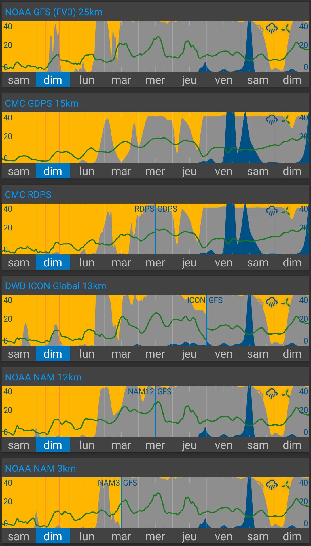
3 Likes
I like!
+1 on this!
1 Like
to me and I know it’s just one opinion but it just looks incomplete and I know @duane likes things to look clean and tidy as do I. ya never know things are always changing and updating 
2 Likes
I’m going with @Hubiug in this one:
Sure @BrianLY-38, above the map it makes sence to make it look complete, by displaying a more long term forecast where a short term forecasts have no data.
But in the compare mode, displaying this is redundant(*), and can actually cause confusion or missinformation.
At a glance one might get the impression that a forecast is more reliable than it actually is, since one is seeing, what seams to be multiple sources agreeing, but actually is multiple copies of the same forecast.
(* Avoiding redundant stuff have also been a theme in the past…)
Cheers!
This is a good idea but maybe a shaded color for the fallback sources would be better.
I just need to think of how to turn it on or off. It easy to do but how do we do the settings. I don’t want to add a specific setting to the settings page. Maybe it should be an element (Shade Fallback Sources) in the “Edit Graph” page.
This it be on both the main map page and compare page?
2 Likes
Or, implement a previous suggestion to allow users to choose alternative models to FV3, tailored to each users location.
2 Likes
That’s a separate feature and requires a few other things in coded before it can be done (think days , possibly a week or two). It doesn’t address this problem of readability.
This feature is just turning something on or off (think hours). I don’t like adding things to settings, i.e., to keep it simple, which is why I think the graph editor. Also should it be a global element (main page and compare page) or just for the compare page.
2 Likes
@duane just compare page if possible but then again it doesn’t bother me the way it is  and I do understand what @Hubiug is asking.
2 Likes
No, I think the main page should not be changed, only the compare mode.
If you go for a shaded option instead of complete removing, then please shade in such a way that affects all colors, i.e. brightnes, contrast or gamma.
This way it will be noticeable both for colorblind people, and for people (like myself) who chose to keep some of the device screens in black and white.
2 Likes
I agree. I definitely agree with making this change on the compare page–the intent of that page is to compare models. I, personally, feel the fallback models should be completely removed from that page (and that page only).
2 Likes
Hi @Daniel_M!
Welcome to the Flowx community!
1 Like
At the moment it’s not possible to distinguish between graphs on the main page and compare page. I am rewriting this part of the code and this may allow these distinctions in the future.
4 Likes