Absolute Values on Map

Hi,

first: Thanks for the great app, one of the very few that actually gives data without much fuzz :slight_smile:

I hope my request hasn’t been discussed already, I haven’t found it at least.

I’d be interested in displaying absolute values on the map, i.e. in some appropriate spacing write the concrete values. Pictures probably explain better what I mean, something like this:


(some random image found via image search)
This is particularly interesting for temperature, wind, and precipitation IMO.

Benefits:
a) it could allow displaying of two/three layers quite comfortably (e.g. values for temperature and overlay for precipitation, which is quite messy with two colour gradients IMO) or
b) make reading the currently active layer even easier / more precise.

So one question is whether this should use data from a separate layer or be an addition to the currently active layer (I could imagine having a simple checkbox in the layer configuration)

The only difficult part is I guess deriving the points where values should be printed on screen. Given a location, the values are already known.

thanks for taking your time to read this :slight_smile:

3 Likes

@incaseoftrouble Hello and Welcome to the Forum and Thank You for Using Flowx

1 Like

Hi,

I can’t draw text on the map yet but it’s planned for the future.

Drawing values in a regular or random arrangement of locations should be easy. Drawing values for key locations is a bit harder.

One major issue is that when you zoom out to view a large area, like in your image, the data that is downloaded is lower resolution, i.e., >100km between data points, so we cannot sample this data at key locations since they will be wrong. So the values for each location will have to be downloaded individually, i.e., 20+ downloads.

I try hard to keep Flowx simple. Personally, I find reading text adds to the cognitive load when using the app, this is why I stick to colors.

Given this isn’t a easy job to do we’d also have to see how many users would use this. I have spent a bit of time implementing features in the past that very few people use so I try to avoid this too.

4 Likes

It definitely makes most sense for zoomed-in view (at most at country / state level). I think key locations is less important (you’d need the data of what is a key location for several zoom levels to begin with).

For me it is the other way round :slight_smile: I find having two color layers much more difficult to parse than one color + one text layer. But that’s personal preference, of course.

One point that I think might be worth noting: Stuff like temperature or air pressure typically tends to be “low-volatility” / smooth compared to rain or cloud coverage, i.e. they don’t change much if you move by, say, 20km (at least I think so, I have no idea about weather, please correct me if I am wrong). So drenching the whole map in color to depict air pressure is “overkill” (at certain zoom levels) in the sense that giving the values at a few locations probably is sufficient to get an idea how the picture looks like and how it changes over time.

Definitely, I’ve been there, too. Maybe this post attracts some attention and we’ll see. It definitely isn’t something with high priority, just some idea that came to mind.

1 Like

I willing to argue with you here regarding depicting air pressure with a whole color map being “overkill”.

In my opinion it is not overkill!

It’s an incredible useful tool to se how the low-pressure areas and the high-pressure areas are moving around, since so much of weather system behavior are influenced by the pressure. Yes, temperature, humidity, wind speed and direction and all the other variables of course also matter.

But the number #1 factor to track, on a “whole map”-scale “in color”, is the pressure.

The key is to set up the color so that you get an intuitive understanding of what you are looking at!

I just posted in another thread how I chose to set it up. The below described setting will show blue for low-pressure areas, red for the high-pressure areas and white/no color for the “normal pressure” showing the transitioning are from high to low or low to high.

1 Like

Okay, replace “air pressure” with “temperature” :slight_smile: It of course depends on how you are using the data. For me, I just want to see how weather develops in an area (particularly rain / cloud / temperature). I personally don’t care too much about air pressure, since I know too little about meteorology to deduce anything from it. And I’m not asking to replace the way you can visualize the data but add another one :wink:

1 Like

Sure, I get your point. :slightly_smiling_face:

@incaseoftrouble weather is developed in different ways ex. warm front meets cold front = potential thunderstorms also depends on amount of moisture is in the atmosphere that’s why you get clouds and no precipitation. Google “how does weather develop” “what is weather” “understanding weather” ect… then you can start to understand how to use Flowx better and to understand what’s being shown.

2 Likes

This is also a feature I’d be very interested in!

I travel full-time in an RV and need to know where the best weather is across the country (or maybe within 1000 miles of my current location), over a given time period, e.g. next 7 days. That way I can avoid snow/rain or seek out warm weather etc. I need to know things like, “Will it be below freezing for 24+ hrs?” in a given destination so we can either avoid it or winterize the RV. Ideally there’d be an app where I can view a list of cities within some defined radius with specific weather conditions forecasted, e.g. no snow or no low temp below freezing for x days etc. I don’t expect this app to have that functionality, but anything that gets me closer to that info would be great.

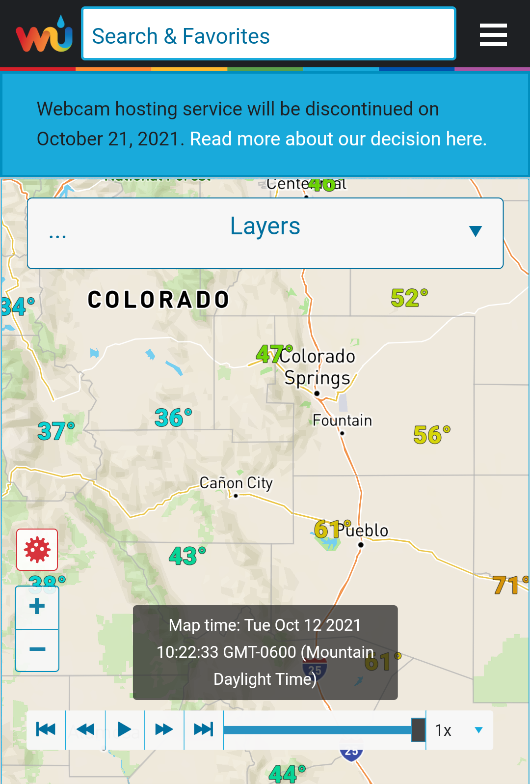
I personally find it easier to scan text than color gradients, but maybe that’s just because I’m used to that format.

I think wunderground does this pretty well actually, where zooming in increases the amount of text that’s visible and zooming out decreases it.

But it’s only able to show me current temps, not forecasted, which FlowX can do.

Anyhow, I also work in software development and don’t have any unreasonable expectations about whether or not this type of feature can be delivered or should even be prioritized, but I wanted to at least toss my hat in the ring in terms of interest.

1 Like

It will only let me share one embedded media at a time as a new member, so here’s another screenshot:

1 Like

Hi @andrewborstein,

Someone has requested this before and it’s quite a complex feature because I need a list of cities, the population and dynamically add more places within a radius based on this. Also I’ve written my own map tiling library and I can’t draw text on the map yet.

I’m the opposite of you and I like graphics over text so I’d like to suggest an alternative graphical approach.

The full feature I plan is a scale bar where you can add 3 values, min, mid and max values, and you have a different color scale between min and mid values, and another color scale between mid and max. The transition between the color scales will be stark. You set the mid value to the freezing line (i.e., 0 degrees Celsius), then you can see the transition easily.

You can actually do something like this now. Turn on temperature on the map, long-press on the color scalebar, put in the -12C for the min value and 36C for the max value, then select “nws_steps” spectrum. This will set the freezing transition to be between dark blue and green.

It’s not ideal but it shows the concept.

Sorry for the “C” values - “I only work in Celsius and sometimes in Kelvin”.

Ha, ha, I just realized this was the post where this was requested before.

3 Likes

It should look something like this:

2 Likes

This looks pretty good! It’s definitely usable with the addition of the mapbox layer through the bronze upgrade. Thanks for the tip!

2 Likes

I’m using that step’s scale with rain, too

1 Like