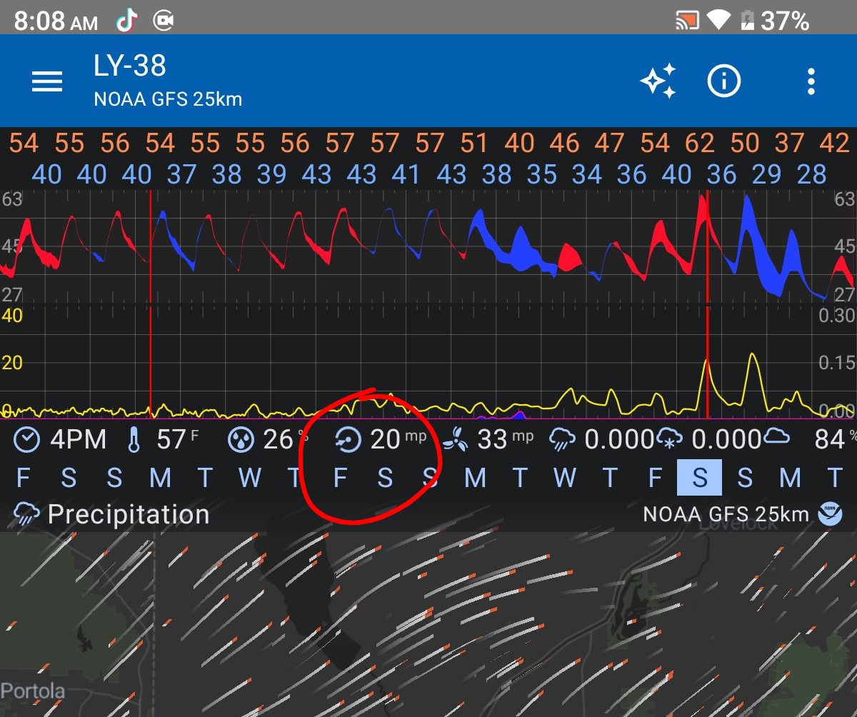
I’ve got a neighbor that likes to burn trash in his yard and it would be nice to know at a glance what days I can open my windows, without having to turn on the wind direction overlay.
It would be great if the line for wind speed on the line graph was color coded depending on the direction that the wind was coming from. Like South is red, East is blue, Southeast is purple, Etc.
Thank you for the tip! I’m aware of the direction indicator.
You’re right that lets you see wind direction without the overlay but, unfortunately that still doesn’t satisfy the use case I described (seeing the next week’s wind directions at a glance), as it requires manually scrubbing the timeline to every day of the week and then memorizing the directions it’s going to be coming from.
Great minds think alike. I think coloring the wind speed’s line graph line itself solves some of the clunkiness that was being discussed in that thread. But given that post was 7 years ago I guess I shouldn’t hold out hope.
Hello. I often wonder about direction when looking at the graph widget. Perhaps for your use case[s] an alternative to coloring one of the speed lines might be establishing Wind Direction as a separate element … could be a line, or a dot as depicted by NWS (and others) … whatever the depiction, the NWS (and Synoptic) sets direction of South in the center of the graph and North on top and bottom edges.
Or, could even use barbs as a Wind Direction element to be used in custom graphs which could remain legible in the clutter.
Heck, I suppose another element type might even be color of graph background (i.e. Temperature Delta) though I wouldn’t want to configure it too finely.