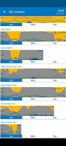
I’d like an option to show white space after the end of forecasts shorter than the Compare Period.
@IEales I could totally be wrong but doubt that will happen he’s trying to keep the app clean and tidy otherwise the compare screen would look choppy although possibly the option to change the color might be an option.
I’d like an option
Those who currently like the transition JUMPS would see no change.
I would appreciate this option too.
Otherwise it’s easy to get fooled to think that there is consensus between multiple forcast when looking at the compare-screen at a glance, not noticing the thin lines and small print telling that to the right there are in fact multiple coppys of the same forcast.
Never noticed until @IEales pointed it out! ![]()
I agree the duplication isn’t ideal, it could mislead the user into seeing a consensus between different forecast models that isn’t really the case.
