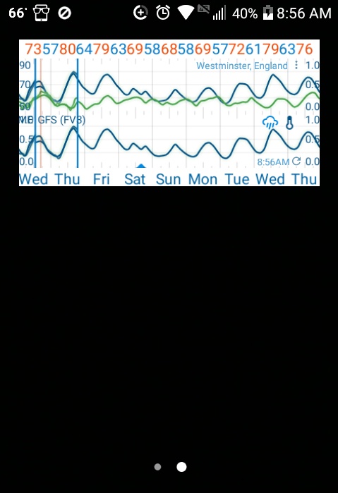
Using the beta version I’m getting double graph lines in the app and widget for wind speed and temperature - only when using Arome.
Also, two vertical time lines, separated by 6 hours, when Arome switches to GFS.
Any ideas ? Beta glitch ?
Using the beta version I’m getting double graph lines in the app and widget for wind speed and temperature - only when using Arome.
Also, two vertical time lines, separated by 6 hours, when Arome switches to GFS.
Any ideas ? Beta glitch ?
Sorry can’t help no Arome
Thanks. I’m based in UK and find Arome very good. Much better than Icon- EU.
Anyway I’ve just sent a debug log. It’s no biggie as the double lines sort of shadow each other.
@Alex Will try it just added Westminster will post findings shortly
single here
yes double vertical lines I’ll keep Westminster saved cause I’ve not had European data before I can’t say if it’s normal or not lol.
Looks like a bug. We’ll wait a bit and see if it goes away, otherwise I’ll look into it.
@duane back to the grind your to do list is already long enough 


Just left beta and am getting the same double graph lines and vertical model switch lines as beta.
@Alex I see it as well
Double Vertical line is fixed. Not ever using European Models tell @Alex forced me to kidding @duane said it’s a possible bug.
Yes, that’s it. It seems like there are two timelines superimposed and out of sync by the time difference between the first and second vertical lines.

The graph has changed. The double vertical lines have gone, to be replaced by the normal single line.
The double lines for wind speed have also disappeared.
Double lines now only for Arome temperature.
So, not quite right. But getting there.
Back to normal. Single lines once more.

 Glad it’s all fixed
Again, I think this is related to the Arome and Arpege update issues.
About an hour ago the Arome graph went from single lines to double lines.
I see them as well Thankfully it’s a beta version @duane will figure it out