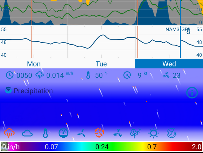
Poor subject, not sure how to word this, but I have the most important data points in the Data Bar (where the time, date, long-tap to Edit/Add/Delete data points) but you can only add so many data points there before they overlap with each other. For example, if I select the Snow data point in the map to see snowfall, it shows the legend at the bottom but doesn’t show a numeric value.
It would be a nice feature for whatever data point you have selected inside the map if it showed a numeric value of that datapoint for the current time and selected location. ie: What the data points in the Data Bar are doing, but dynamic for whatever data point you have selected in the map. I think if it showed it above the data icons in the map that would be logical, not take up any extra space, etc.
This has probably been requested before and I’m not finding the topic. Thank you!
What @khaytsus is asking is that when you select something to show on the map, it shows the values of that data. There are two ideas associated with this:
to show the data value in the map details bar at the top of the map, e.g., [humidity icon] Humidity: 72%… GFS.
add a little bar to the scalebar that updates as you swipe, just like the timebar.
These updates are planned after the major rewrite is released.
It means you don’t have to add a gauge for every data type you want to see which will take up a lot of screen space. You can see the values at your place for any data you turn on on the map.
For example, I have 14 possible data types I can turn on on the map. I don’t have 14 gauges (which would take 3 rows to show), I only have 4. But every time I show one of the 14 data types on the map, it will show the data values next to the data label.
The code is actually in the new major rewrite but I’m refraining from turning it (and many other things) on because if I release the major rewrite with too many changes users complain.