Ohan
July 16, 2026, 12:26pm
1
Continuing the discussion from New Model: UKMO 2km :
Because of the variable forecast ranges, Flowx has a NEW FEATURE to overlay multiple model runs in order to display the best available data extending out 5 days.
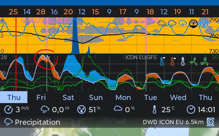
You will see details in the Info dialog and on the graph with the transition lines:
“@” means the current or latest forecast
“>” means the extended forecast
“>>” means the maximum extended forecast.
For example, if the latest forecast extends 12 hours, the previous forecast extends 54 hours, then you’ll see all three symbols (@, >, >>) on the graph where the last symbol (>>) represents the older 120 hour forecast.
This is a cool feature!
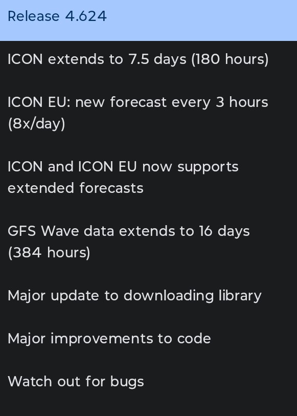
I installed the new version:
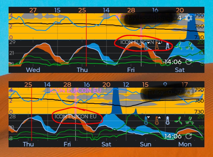
For me I see the “@ | >” in the second graph in the app itself only. Not in the first graph. For me that is fine but is it intended to be like this @duane ?
I also don’t see it in any graph of any of my two widgets.
I tried to restart the phone, since that sometimes affects the widgets, but the widgets look the same after rebooting the phone.
1 Like
Alex
July 16, 2026, 5:31pm
2
The map icons change sequence, depending on the update cycle.
The widget icons and map icons are not mirrored.
2 Likes
duane
July 16, 2026, 8:00pm
3
The repeated model name in the top graph is a bug.
The graphs and widgets have different code and I haven’t implemented this for the widget code. I do plan to merge this code soon and this will fix the second bug.
2 Likes
Ohan
July 17, 2026, 6:49am
4
Not sure if related but when adding a whole new graph, the source transitions lines and labels temporarily disappears until the app is restarted.
1 Like
duane
July 17, 2026, 7:30am
5
I can replicate it so it’s common and I should be able to find it and fix it.
2 Likes