Is there any way of overlaying isobars on fields such as wind speed, temperature or precipitation? I realise it is possible to get a standalone view of the mean sea level pressure field colour filled, without the option of isobar plots on these other fields the app is much less useful to me.
1 Like
@sinjun Hello and Welcome to the Forum and Thank You for Using Flowx
1 Like
Hi @sinjun and welcome to the forum!
This question have been asked before and then the developer @duane a answered this:
However:
Hope this answer is any help.
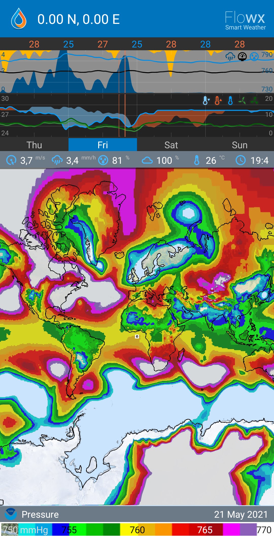
@sinjun you can for example make it look like this:
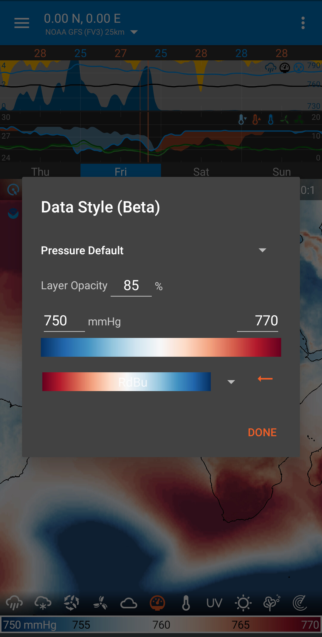
Long press on the color-bar below the map to change the settings for color and the range.
Personally I prefer this settings (RdBu is the 11th from the bottom of the list).
Zoomed in a bit it is looking like this:
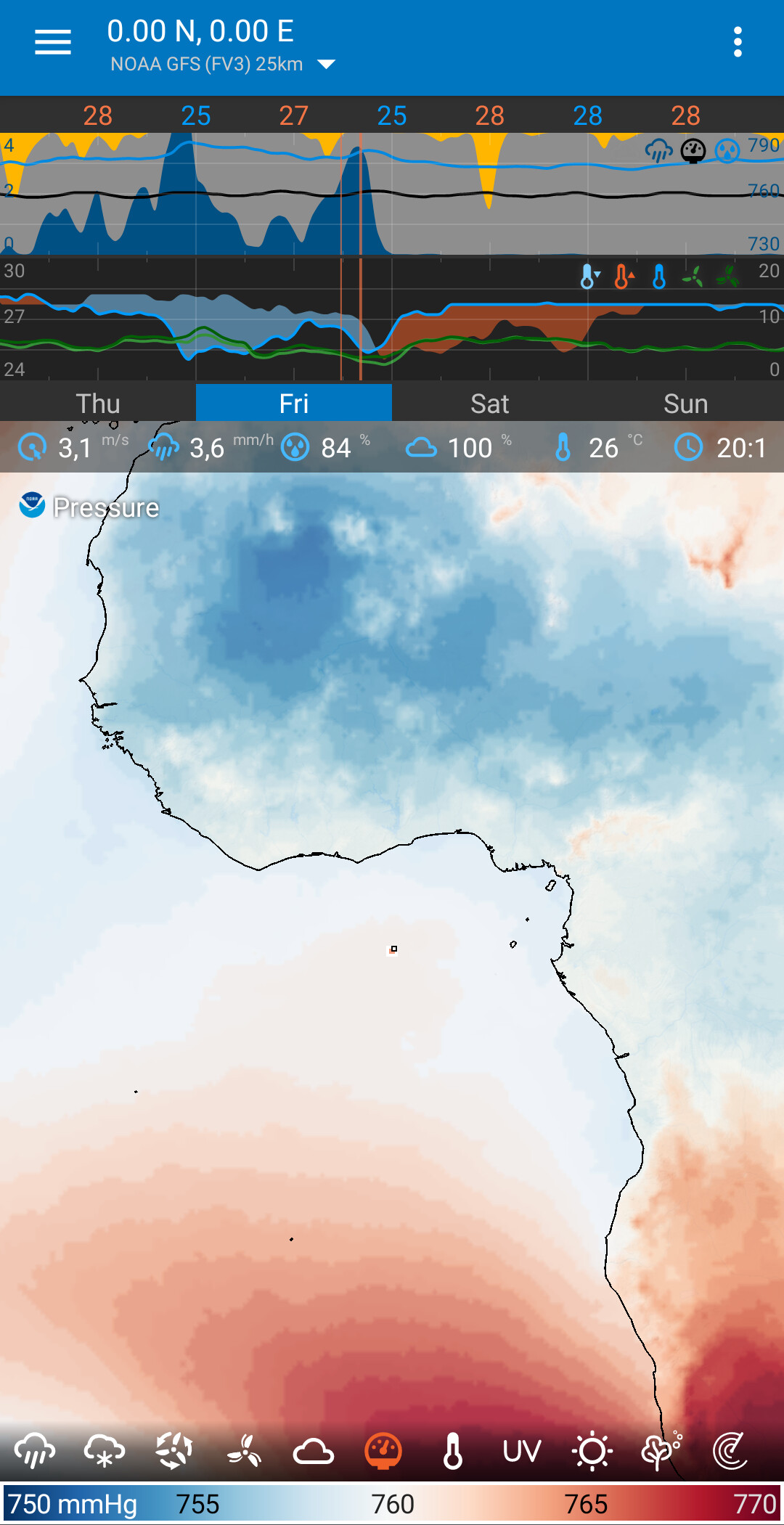
As you can see, the limited number off shades of color actually turns into a feature: something that’s looking like isobars.
Thanks for the suggestions everyone. A stepped colour fill with a range 976 to 1040 gives 4 mb intervals and something a little more useful. I didn’t realise everything was computed on the fly, so I see the problem. Would it be possible to make a colour scheme in which everthing was white (or transparent) but intermittently black the ranges 999.9 to 1000.1, 1003.9 to 1004.1, 1007.9 to 1008.1 etc. ? That way the fast colour fill routine could be made to produce isobars. Probably would look a bit rougher than a contouring scheme but may well be good enough.
1 Like