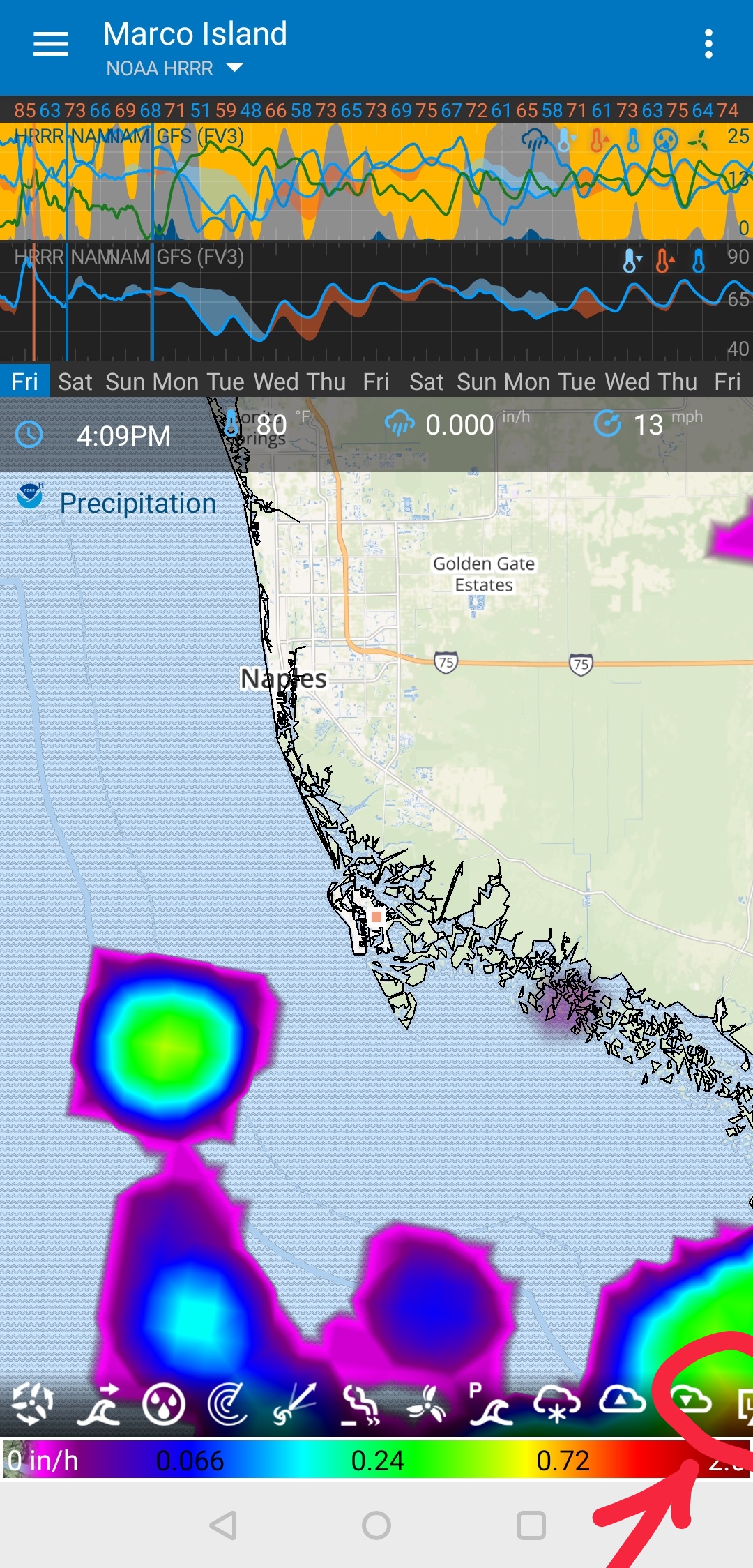
Map data icons truncate and there seems to be a fixed number that can display, restricting what can be view to work with on a give a map to and extremely small percentage of what’s available. As you can see you in the attached image, an icon can be just cut in half on the right of the screen, and if there are any beyond that, they’re inaccessible. The row isn’t slideable, nor does it stack a second row. The behavior is the same regardless of where the row divider is, with the exception of which icons are visible changing if the dividers is positioned at a different spot in the sequence.
Please tell me that we’re not restricted to such a small, hh
Just edit place and move the “Menu Separator” to the bottom, i.e., the last item. Then you can slide the row of icons back and forward.
I’m actually in the middle of fixing this. I actually remove the “Menu Separator” so there will only be one zone of icons. Later I plan to group icons, so you could have one wind icon that when clicked opens a menu above with wind speed, wind gusts and wind streamlines.
Unfortunately/fortunately, I ended up going down a rabbit hole and refactoring much of the code. I hope to finish this soon. Other work has interfered.
I agree, I like it too. I expect some kick back. But it was difficult to code up the logic to fix the bug above. This is why I went for the simple approach.
The simple approach is that you can add data icons to the menu and slide the overflow left/right. You can also long-press on an icon to drag-n-drop to reorder them. That is all there is to it.
I’ll have a quick look at adding the container to the right. Maybe call it a “Pin Container” and when you add new data, it goes in the left container by default. Then it’s obvious what happens when the “Pin Container” grows and overlaps the sliding container.
May I suggest that the easier solution may be to keep with your current approach of simplifying it into a single, slideable row, but creating spacers (just blank transparent icons) to put between the data icons in the settings customization. Users can then create a very similar effect to left and right menus without the complexity of multiple containers.
The spacers will create a visual cue to a different group, but the separated group will still slide out of view. I think the “pin” option is good since it’ll force it to always be visible which would be more useful for often used icons. Maybe, I can create a left and right pin container. I’ll look into this.
Ha, ha, yes it’s completely gone. It was on my list of something to re-add. Then after I released it, no one complained and so I thought “Ok, maybe it’s not a highly loved feature. I don’t need to re add it”.
You are first to mention it
I like the simplicity of the slider but can see the utility of a pin feature. I might leave it an see if it’s something we really want. Pinning is difficult to code with the long-press and drag feature.
Separator is even harder. The reason I removed the separator is that users were accidentally adding too many icons to the right region and there was only a small area to view and slide in the left region.
Also the separator wasn’t intuitive/simple.
What I wanted was for a small box to appear in on the right when you drag an icon. If you put the icon in this box, it gets pinned. Then we can have a left and right box.
When you consider the above, you have to like the simplicity of just one container.
Oh, btw, one day I want to add “Submenus” where another menu will appear above the current menu where more icons will show. So, for example, you might have all precipitation related icons in that menu, rain, snow, radar, accumulation, etc…
This should reduce the number of icons required in the main menu and the pinning might not be needed.
I can see how this works when your icons fix and there is space to add between them - this is easy
The problem is when there are more icons that fix in the container, then the does spacer collapse to nothing and the icons don’t act like they are pinned?
But the time you really want pinned icons is when you have too many icons and don’t want to keep sliding left and right to find popular icons.
When you only have a few icons all in view, you don’t really really need to pin icons
Perhaps “pin icons” is not the way i would describe the desire when only having “a few icons all in view”.
And I do understand that “when you have too many icons” is a user-case that might seam appealing to prioritize.
However when the number of icons are just below what can be shown in the display, up to 9 icons in my case, then its relay nice to be able to separate them to a left field and a right field. When the “empty” spot is in the middle the map just looks way better compared to when the “empty” spot is all the way in the right corner.
Besides, if we are limited to only 3 active layers at the same time, how many users (especially new users, (thinking about growth)) do have more than 9 icons on the screen?
How about a semi simple approach that is similar to the way things were before the menu separator was removed, but with a fix for the issues that it caused:
Force the sliding part of the container to always be at least half as wide as the map, and decide if the left half or the right half is sliding, depending on if the menu separator is in the first or second half of the list.
I think this can be achieved by using below semi-code:
set a variable “max_non_sliding_icons” to half (rounded down) of what can be shown on the screen
if “total numbers of icons active” are less than (or equal to) 2x “max_non_sliding_icons”, AND if “number of icons to the right of the menu separator” is less than “max_non_sliding_icons” then behave just as before the menu separator was removed.
if “total numbers of icons active” are less than (or equal to) 2x “max_non_sliding_icons”, AND if “number of icons to the right of the menu separator” is more than “max_non_sliding_icons” then behave as if the menu separator is “max_non_sliding_icons” number of icons from the end of the list.
if “total numbers of icons active” are more than (or equal to) 2x “max_non_sliding_icons”, AND if “number of icons to the right of the menu separator” is more than “max_non_sliding_icons” then behave as if the menu separator is “max_non_sliding_icons” number of icons from the end of the list.
So far 1-4 can be produced by the same code: if “number of icons to the right of the menu separator” is more than “max_non_sliding_icons” then behave as if the menu separator is “max_non_sliding_icons” number of icons from the end of the list.
Here comes “the flip”: if “number of icons to the right of the menu separator” is more than half of “total numbers of icons active”, then behave as if the menu separator is “max_non_sliding_icons” number of icons from the beginning of the list, and make the left part of the list non sliding, and instead let the right side of the list be sliding.
It was possible before the menue separator was removed. It was in a menue, and not on the map.
How about long pressing on any icon on the map opens a menue where the icons, and a menue separator can be rearenged? (similar to the old “edit place” there the icons could be dragged upp end down.)
Yes, we can do this but it’s more work and not intuitive, elegant or simple. I just spent weeks changing this to a be drag-able. Adding a menu will be going back to what we had - not very nice.
Ideally, I want a red box highlight when you start a drag and you can drag icons into this box to pin them. Also drag icons already in the red box to reorder them. If you compare this method to the menu method - it is clearly superior in my mind.
I like simple, this is why I’d rather keep the current method if there aren’t too many complaints. If there are many request for pinning, then I’ll look at implementing the red pin container again. But this would take a bit of time and research - time better spent elsewhere - like spectrums …