On a phone, with limited screen size, the number of metric icons displayed could be increased by moving the truncated clock up next to the apple icon.

2 Likes
ah yes the battle of keeping the spacing equally across multiple device screen sizes. had this issue when I was learning VB6 would look perfect on my screen but not so much on others 
3 Likes
@BrianLY-38
Thanks for that.
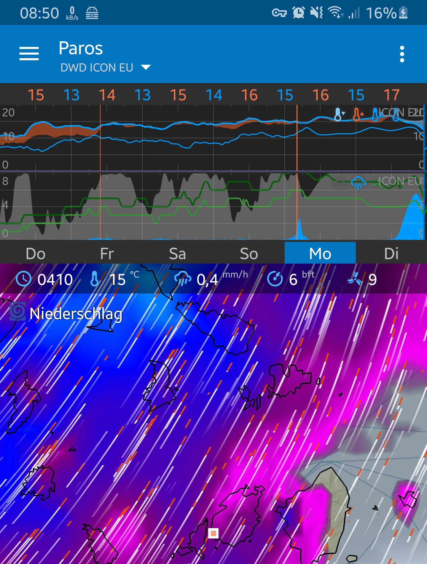
It’s probably not possible but just eye-balling the screen the top area seems to be relatively unused.
2 Likes
@Alex true  could already be on the long to do list seams like a couple things get checked off and 20 get added
3 Likes
I understand the problem with limited screens, but this should be an option, because I like it very much as it is.
One single line with data of the actually displayed timeframe which corresponds to the cursor position.
I would not enjoy to split these data to several locations on the screen
3 Likes
@tiwag good points
Maybe a better suggestion would be: as an option and only for the clock.
3 Likes
@Alex i could imagine, the free space could be perfectly used to show the long Date and time if wanted as an option.
As stated before, i personally like the time with the data values, because i write them as forecast in my logbook
3 Likes