Hi,
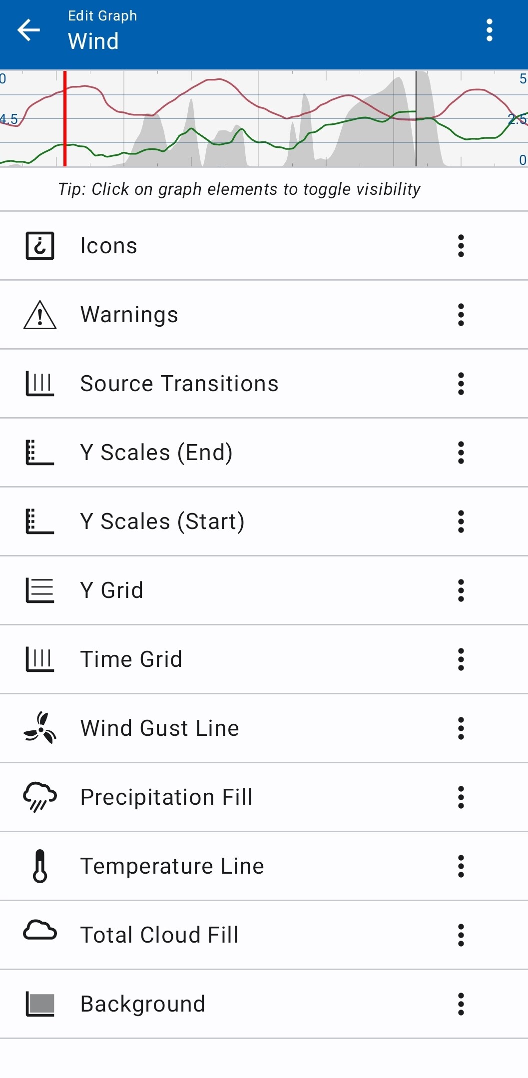
I usually see data source labels on the weather graph, but they have recently disappeared. Accessing the Graph Editing feature shows the Source Transition function (which can be switched on and off), but the labelling function is missing.
I’m using the Wind graph type, with precipitation, cloud cover and temperature lines added.
Is anyone else missing the add labels option?
1 Like
Most likely you have by accident taped the 3-dot menu on the Source Transition Label, and then delete.
You can add it back by:
- Long press on graph
- Then Edit graph
- Tap the 3-dot meny on any item and
- then tap on “+ add”
- Scroll down and tap “Source Transition label”.
Cheers!
1 Like
If only it were so easy, lol!
That’s not the answer - as I said, that option isn’t available.
Here’s what I see:
1 Like
Check out this post - they had the same issue:
https://forum.flowx.io/t/combining-elements-into-one-graph
2 Likes
Also read the “Graph Editor” section of the help:
2 Likes
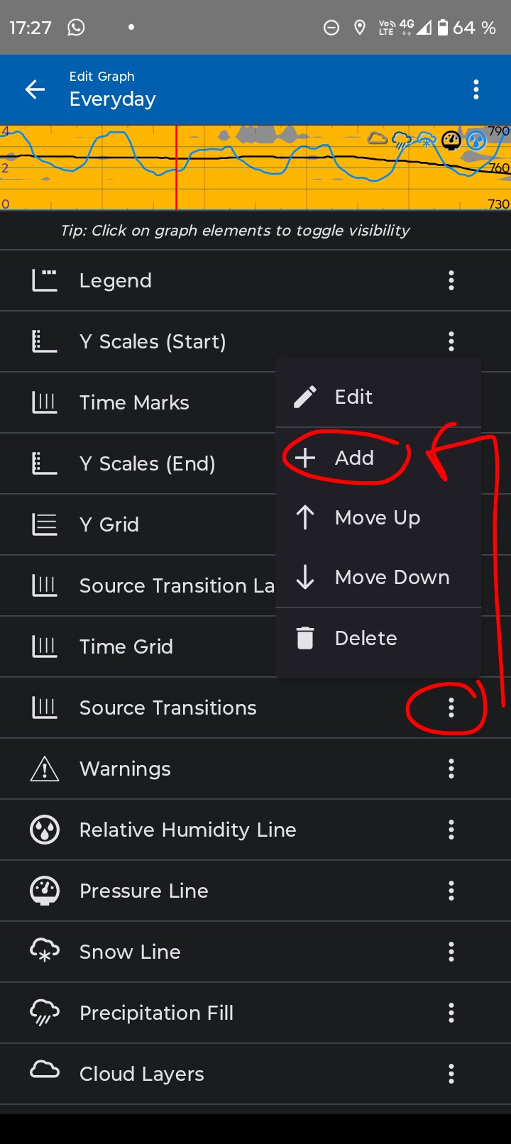
Ok, but what do you see if you:
- Tap the 3-dot meny on any item and
- then tap on “+ add”
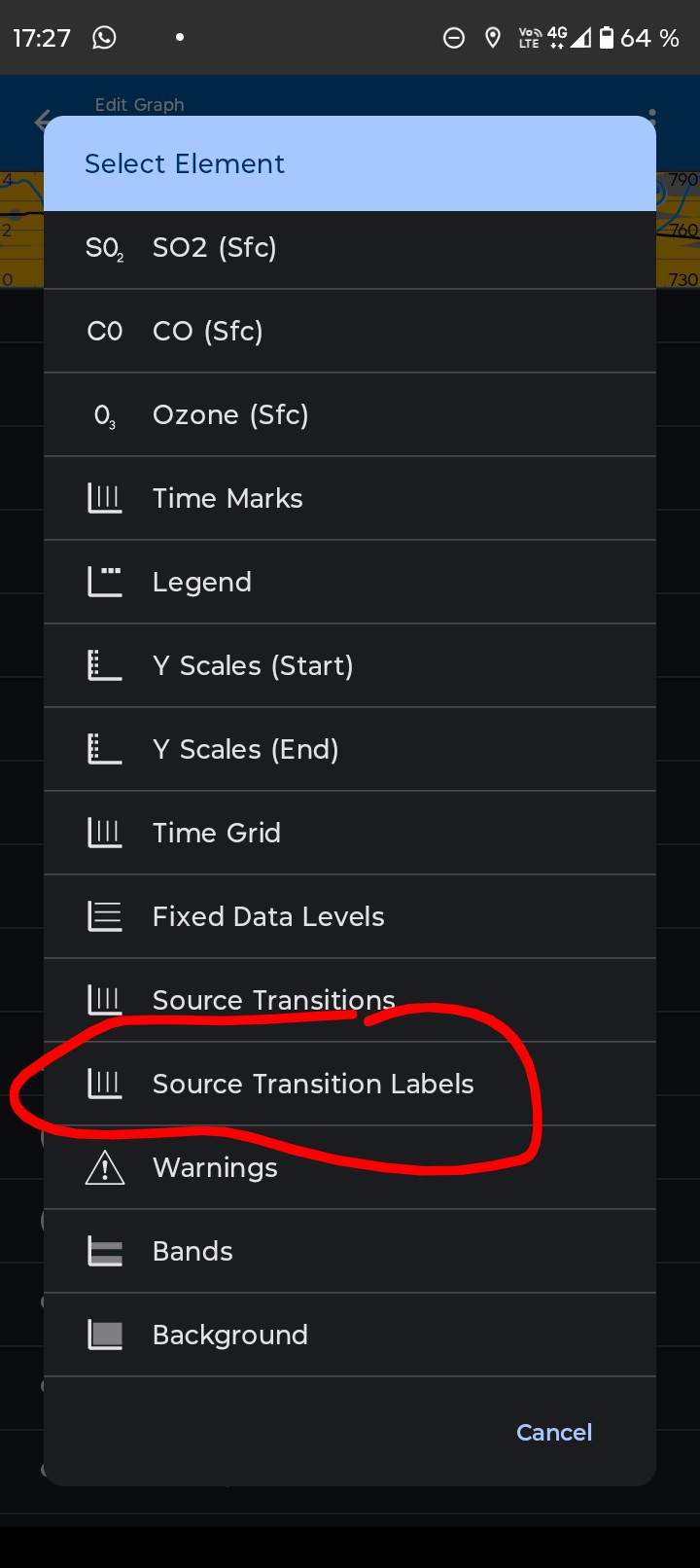
- Scroll down and look for “Source Transition label”?
I see this:
Hi Ohan,
Thanks for your input! My original post showed the options that were available to me and the Transitions label was missing.
After much faffing, I decided to do an uninstall/reinstall and the labeling option has returned, but I cannot add a Temperature line as I could previously.
I’m intrigued by the fact that your setup shows Snow Line and Humidity options whereas mine doesn’t. This makes me think that there are either inconsistencies between installations, or that there is some ways of adding custom graphical items. If it’s the latter, I’d really appreciate knowing how this is done.
I’ve been a Gold subscriber for a couple of years and my perfect graph has lines for temperature and wind gust, plus total cloud and precipitation fills, along with transition lines and labels. It’s what I had until recently when Transition Labels disappeared. I haven’t altered anything and can only think that an update has caused the issue, but I can’t pin it down.
Thanks again for your thoughts and my fingers are crossed that you might be able to help me get back to my preferred setup.
Cheers,
Pete
1 Like
Yes to the latter! This is what I’ve been trying to explain to you.
What you described and have shown in you image is the “Edit graph” page. In it you can toggle elements to be shown or hidden.
You can also edit, add, move up or down, and delite items in the “Edit graph” page.
In my previous post I sent two images, the first one shows how to open the small menue from the three dots to the right that let’s you modify the content of the “Edit graph” page.
The second image shows the “Select elements” menu that pops up when you select the add option. This list is longer than can be displayed on a single screen, so you need to swipe up/down on it to scroll to the bottom where you can find the “Source Transition label”
Best of luck!
2 Likes
Hi again Ohan!
I want to apologies for my dimness, I hadn’t realised that the ‘Add’ option gave access to additional elements. I now have a graph that works exactly as I want it to. I think that my confusion was because ‘Add’ is a global function whereas the other menu options, move up and move down, and edit are dedicated to manipulating the named element.
Anyhow, thanks for your patience and persistance!
Regards
Pete
3 Likes
Glad to help.
Cheers!
2 Likes