Noticed that the widget has seemed to have changed. It looks like the scale has changed. Like it’s scrunched up and the spikes are much more pointed and sharp in appearance. Has this happened intentionally and ri anyone else? Thanks.
1 Like
Hi and welcome to the forum!
Did you change the scale for the place that your widget is based on?
@Genisis, please post a screenshot. I find screenshots can get people on the same page. There has been many times, I’ve discussed things for ages and then finally get a screenshot to realise we’ve been discussing different things. Then it took one reply after the screenshot to clear-up things.
2 Likes
Thanks for the reply. I waited to see if there was any changes today. It’s appearing that there was some extreme fluctuations in are weather patterns yesterday causing rapid changes from one hour to the next. I am assuming that was the reason for the sharp graphing. The widget seems a little more normal today.
2 Likes
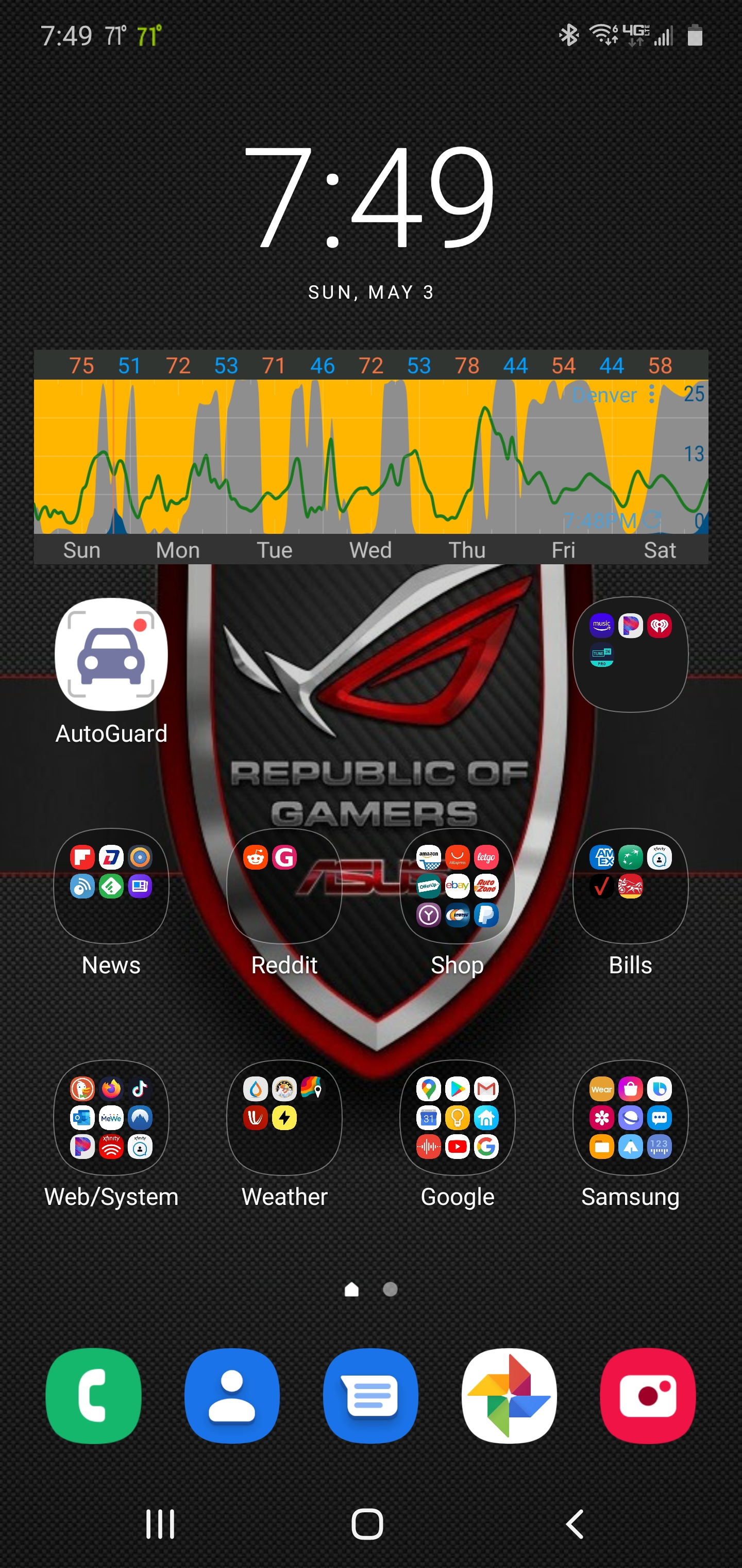
In the last release, I added 1 hour time steps for GFS and ICON data instead of the usual 3 hours. The other change was HRRR with 15 minute time steps. This is why you see higher variation.
Keep an eye on the change via the little flame icon at the top right. I might make the changes popup automatically with every new release.
Cheers, Duane
2 Likes
I haven’t made any changes. I’m pretty sure it is ok. The 15 minute time step change is why the graph is looking different. Thanks again.
2 Likes
This was a new update/release in the app. GFS is now 1 hour time steps instead of 3 hour steps previously. You didn’t have to change anything, it was part of the update.
2 Likes