Is it possible to add a synoptic chart overlay? I’m not expecting fronts, or even labels for high and low pressure areas, just contour lines for pressure. The wind direction gives good hints but it’s not nearly as easy to read.
3 Likes
This is on the todo list. It’s difficult to do it dynamically with swiping which is why it hasn’t been done yet.
3 Likes
Hi clydeps, that’s a great idea. If you are not too concerned with all the synoptic chart annotations (they are fairly obvious to the trained eye), then displaying pressure using the nws_steps colour scheme as shown in the Flowx screen clip vs. the official synoptic chart, you get a pretty good approximation with the official version.
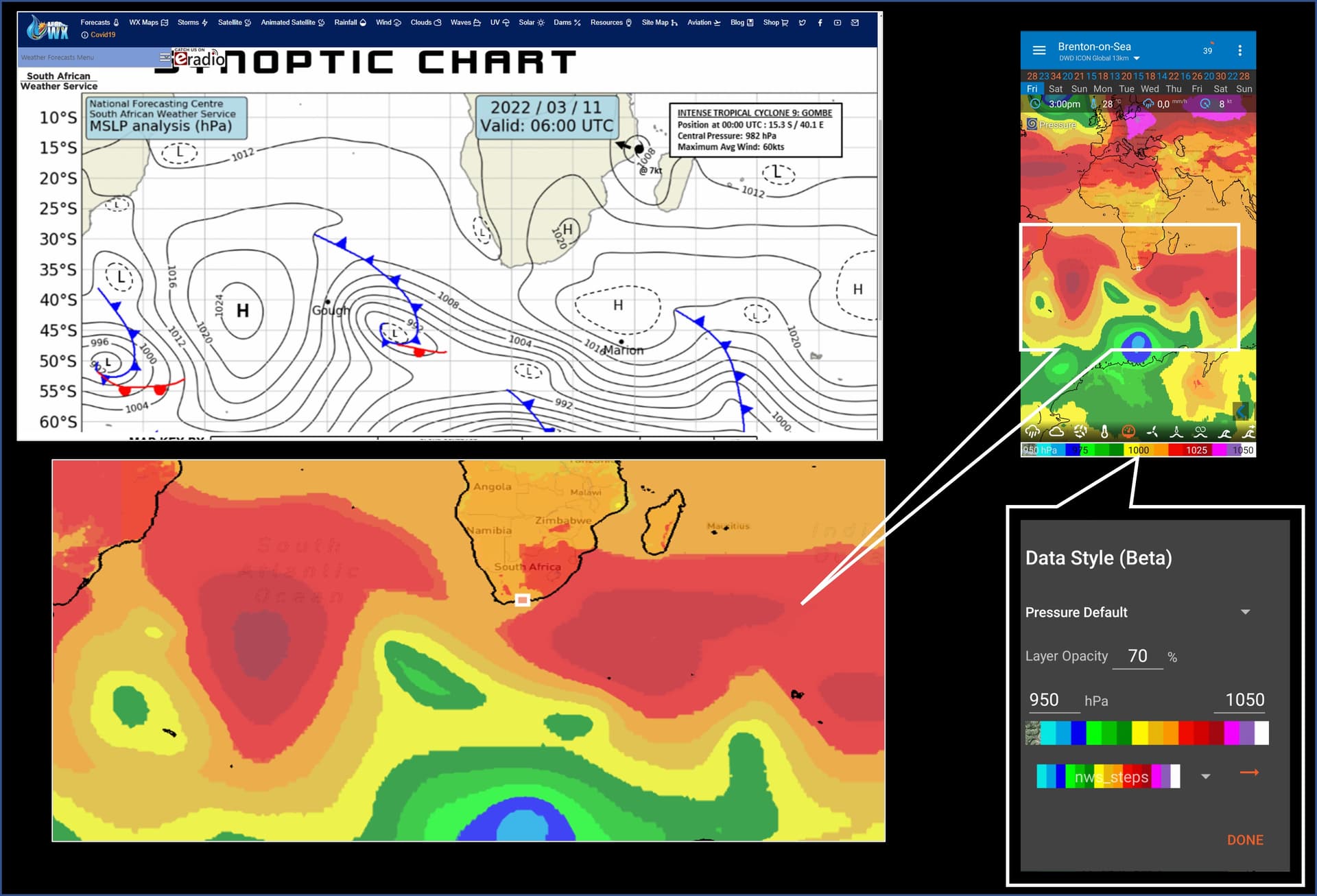
5 Likes
Maybe this color spectrum or something similar should be the default for pressure??
I have been thinking about having a better set of default color schemes for precipitation, wind, cloud, etc… The ones I chose 10 years ago are pretty lame.
3 Likes
Also thanks @Ferdi.Brenton.on.Sea for the great infographic ![]()
2 Likes
Thanks - that’s a great tip. It does most of what I want, especially with the wind streamlines. Fronts and troughs are largely subsituted for by rain and cloud overlays too.
I actually hadn’t realised that the little gauge icon represented pressure, nor did I know you could change the colours by long-pressing the bottom bar ![]()