Hello, when adding more than a few data readings to the pinpoint time bar, the data becomes scrunched. It would be nice to see the time information bar allow you to scroll the data information as you can with the bottom section bar.
2 Likes
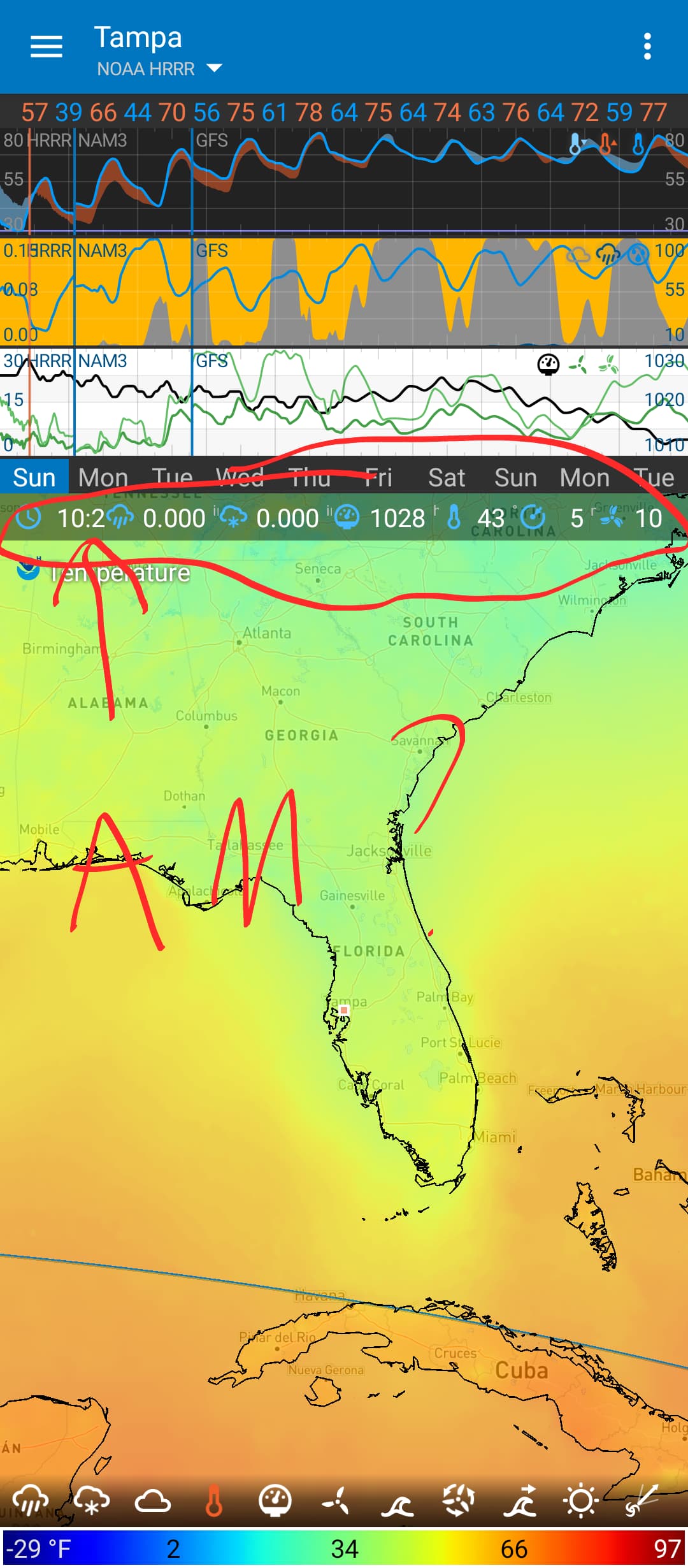
Someone has suggested this recently and I’ve added ti to the todo list. But I wonder if scrolling this is moving away from the “all-on-one-page” design. One thing I dislike on other weather apps is scrolling all over the place to find and compare data.
The alternative, which is also on the todo list, is to all multiple rows of data. See the “[Apple Updates](https://Apple Updates)” post to see it implemented.
3 Likes
Yeah, I think that the option of a second row is better than scrolling it sideways.
1 Like
@Mackinac Hello and Welcome to the Forum and Thank You for Using Flowx
2 Likes
Same. I would much rather lose vertical space than have to scroll.
1 Like
I agree it’s better not having to scroll. Seeing everything on one screen is a great thing about this app!
So I’m wondering if it would make sense, when the phone is held horizontally, to split the data and the map top and bottom instead of side-by-side. I realize the map view would be limited, but it might be more useful being able to flip the phone back and forth to see the data. The side-by-side view doesn’t offer anything different from holding the phone vertically.
Just a thought.
2 Likes
The landscape view was designed for tablets. The top/bottom layout doesn’t look good in landscape mode on a phone. The only advantage of side-by-side view on a phone is the extra graph and gauges.
But in the future, I plan to allow you to choose the layout in each orientation or even change it on the fly. For example, you may have top/bottom layout in portrait but have two maps side-by-side in landscape. Then you can compare models (GFS vs GDPS) or view more data at once. I think this would be useful.
4 Likes