The top scale is always temperature, max and min. For graphs and widget, regardless of content
Would it useful to add a top scale selection option?
2 Likes
@Alex good question not sure how it would effect the redrawing graphs but great conversation starter 
2 Likes
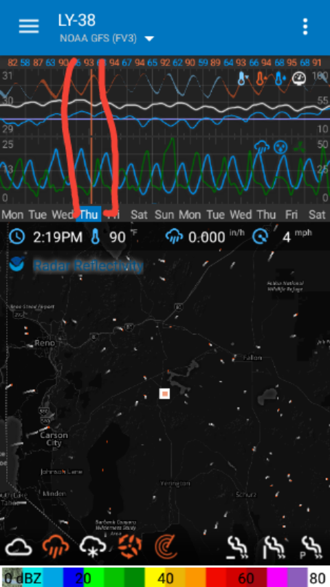
While we are discussing scales. Maybe the bottom scales could do with day separator ticks/vertical lines ?
1 Like
It does the day turns blue.
1 Like
Sorry, I didn’t make myself clear.
Vertical demarcation lines, separating each day within the period selected.
1 Like
@Alex I see what you mean when you are on a certain day in the graph/s 2 lines extend interesting idea
@Alex, sorry I don’t quite understand what you mean? Maybe an annotated screenshot?
So I refer to the ticks on the side of the graphs and colorbar at the bottom of the map scales.
The top bar I call the high/low temp. bar, and the bottom bar, the “days” bar.
The graphs do show lines separating the days.
Cheers, Duane.
1 Like

2 Likes
I’m suggesting that the Hi/Lo Temp bar be selectable because it’s meaningless when I create a widget or graph without temperature.
The vertical lines, demarcating days, could be just upticks.
1 Like
Well done. That’s it.
2 Likes
@Alex, are you asking for two things here? I think this is leading to my confusion.
-
vertical lines demarcating the currently selected day.
-
be able to select (as in the ability show or hide, turn on or off) the Hi/Lo temp bar?
Cheers, Duane.
2 Likes
Yes. Two suggestions.
Selecting the temp bar is the main idea. E.g
switching to Wind max/min or whatever is appropriate for the graph parameters.
1 Like
Ok, I see, I plan to merge all the graphics together so they can be added and removed anywhere. At the moment, the graph box is separate from the other two elements (Hi/Lo and days). When I merge them, you should be able to add them anywhere and move them around.
Cheers, Duane.
2 Likes