What is the meaning of the blue and red areas in the temperature graph? [Answered]

Hey all,

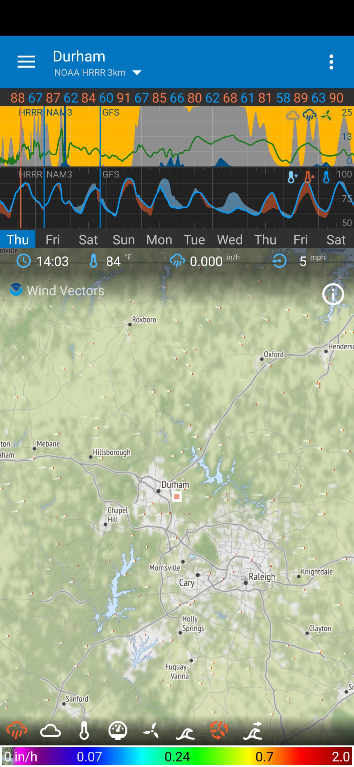
I’ve been happily using Flowx for a while now, but there’s one thing that I just don’t understand. I checked the docs on the interface, and it seems that either the documentation doesn’t cover this aspect of the interface, or I’m just too thick to understand it. The temperature graph just below the precipitation graph (and above the days of the week) has parts were the line of the graph is thickened–sometimes in blue and sometimes in red–and I don’t understand what this represents. Can someone help clue me in as to what exactly this means? Thanks in advance!

2 Likes

There is a brief description in Graphs - Flowx (see #2 at the top section).

But a better description might be in my new help:

Let me know what you think - I’m trying to improve the help.

4 Likes

Ah–the mystery is solved! I think the new help is perfectly fine as it is.

Thanks for your help!

2 Likes

@yeliaB Hello and Welcome to the Forum and Thank You for Using Flowx

3 Likes

Hi @yeliaB and welcome to the forum. Glad that you got the answer.
I’ve updated the title of this topic to be more descriptive.

Cheers!

3 Likes