I’ve been patiently wanting to ask about this for years
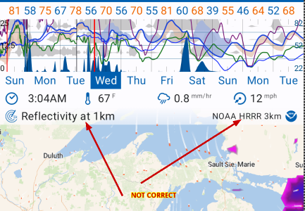
The top dataset (i.e. Reflectivity) and the model (i.e. NOAA HRRR 3km) are shown beneath the graph, and beneath the time, temp, precip, wind; and above the map …
When scrolling through time, of course the HRRR only goes out but a few hours a mid-range model takes over; and then again to the longrange GFS.
I’d love to see the subject line displaying dataset and model change to reflect what is actually being represented at the time displayed.
Thanks for your [re-]consideration of this matter.
The original use of the label on the top right was to indicate attribution (e.g., copyright) for the model that had been chosen. It is still the purpose of this label so it is correct.
I understand the value of having it change as you swipe through time and this has been on the todo list for a long time but it’s not a priority compared to other jobs because you can you can see what model it is from the graphs. <— this is what I was pointing out in the above post.
The job on the todo list is to change the model as you swipe plus show the value of the selected data at your location - in other words, a dynamic gauge.