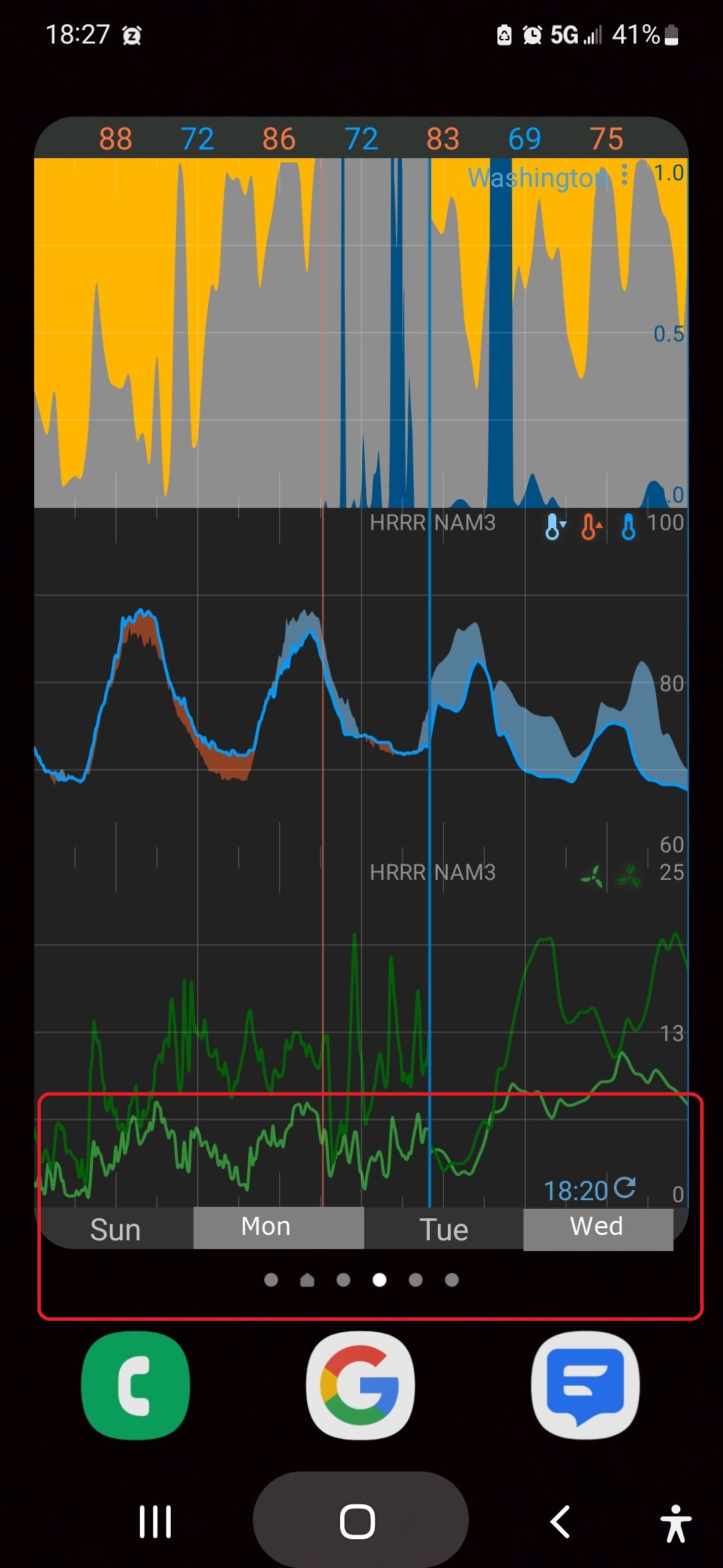
I would find it easier to read the charts if the X-axis alternated colors as in the red box in this modified screen shot. If it’s doable, please consider.
1 Like
And where would the existing lower sections be placed ? On top, below ?
IMO your suggestion would just clutter up an already full area of the map.
2 Likes
Hmmm. I guess I was not clear enough. All I was suggesting is that the shading of the already existing day labels be enhanced. Nothing new would need to be created, so nothing needs to be moved.
2 Likes
Shading ?
Selected day is a solid colour, bright blue. Other days are very dark grey/black in dark theme, otherwise solid white.
So, sorry, but I’m having a problem in understanding the issue.
2 Likes
The request relates to widgets (like in the original screen shot). Are you the developer?
2 Likes
No, not the developer.
1 Like
I’m the developer. I think it’s a good idea. I’ve added it to the todo list. I just have to think of a way to implement it. I think it’ll be a styling thing using the style editor which hasn’t been developed yet.
3 Likes