Starting today (Nov 29) I noticed that cloud cover appears very different in the NOAA GFS 25km graph versus what it was earlier this week. I’ve not seen this behavior before.
I decide on what defaults are based on what I believe will value the most users.
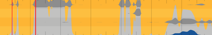
The layered cloud on the graph will easily benefit all users for one good reason - the equations used to calculate total cloud misrepresents the actual cloudy state. If there is 100% high cloud and 0% low/mid cloud, total cloud will show 100%. See the graph below with the total cloud shaded in a lighter grey.
I know people hate change (I try to keep it to a minimum) but change had to happen for Flowx to get where it is today and will keep happening in the future. If you get pissed off with change, then maybe Flowx is not for you.
This is what Flowx would look like without change:
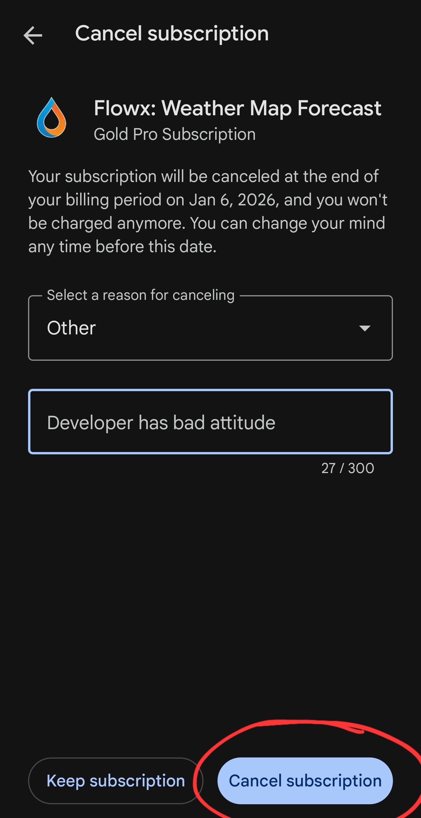
Wow what an attitude.
I won’t argue with you about what you think is best. I will tell you what’s best for me and I like the cloud setup the way it was. This is what I pay for: what I like.
I never said I get pissed off at change.
You provided neither an ‘easy’ nor intuitive way for me to revert to the previous cloud display. I had to spend time researching how to do it, finally seeing another user’s helpful post. My time is expensive.
Your screen shots are meaningless to me. Maybe this means you are making assumptions about subscribers that are incorrect. Step outside of your bubble and consider this.
As for the new default cloud display - it isn’t any more helpful to me, only more cluttered. Maybe offer an explanation to why you even did this. Does it mean the day will be cloudy? Or not? More sun, or not? How does the changed display help determine this any better than before?
After many years of using apps - and paying for them - I’ll spend my money where I feel I’m getting the best return on my investment. Don’t need you to tell me what to think about it.
I’ve attached screenshot of the one thing you may have lost sight of.
Good luck running a business with your current attitude.
I work damn hard on Flowx and I care about the app and it’s users. Because I care, I take things to heart.
This seems like a sarcastic “Thanks” followed by what I think is just a dump on the developer. I read this to mean you were pissed off at the change. I understand some people want to vent. I personally think there are nicer, kinder and more respectful way of expressing this.
I get these kind of unkind comments in the app reviews. Because I care it can get to me and it can sends me into dark places. This is the reason I stopped reading review two years ago. I don’t want this kind of stuff on the forum. It is just not nice.
Some people don’t understand the effort that went into implementing this feature and the consideration for falling back to the previous default.
I literally wrote “If you prefer the total cloud layer, edit the graph and toggle the cloud elements.” in the What’s New pop-up dialog. I updated the graph help pages.
I did consider showing a pop up asking if you wanted the old way or new way but most users will chose the new way. Some, like you, might want to revert back, so I’d need to add a way to revert back. This gets very complex, adds more chances of bugs and would’ve probably taken a day or two to implement. A how-to message in the “What’s New” pop-up dialog is a reasonable approach.
What more could have I done??
I will try to explain more. On the second day in the graph, you can see that there is only high cloud, and no low/mid cloud. High cloud usually means high wispy cirrus clouds and the day feels sunny. But you can see the total cloud graph (light grey) shows 100% cloud which suggests a very cloudy day when it’ll likely be a nice sunny day. So total cloud is very deceptive and cloud layers is far better.
I give you the tools to interpret weather. Although, I did explain more, I am not a teacher of how to interpret weather - I’m not even a meteorologist - it is beyond me and there is a lot of information online. I really can’t do everything.
Money has not been the primary driver for developing Flowx. I really love developing Flowx and giving people a tool that gives value. I always believe that the money will come if you provide value.
I know I’m sensitive to user comments because I care and am invested in Flowx. It is something I’ve struggled with over the 14 years. I have come up with strategies to avoid this, like avoiding app reviews. In the last year, I’ve started ignoring some users who are not understanding or nice to deal with. You can see this means disengaging but this can lead to a soulless company which I don’t want.
The internet is a toxic place. Don’t buy into it and add to it. Be understanding, be nice and be kind - this will improve the internet.
RESPONSES TO DUANE’S POINTS
Duane: This seems like a sarcastic “Thanks” followed by what I think is just a dump on the developer. - - -
Wrong. I was literally thanking whoever the guy was who had posted the workaround. I followed it up with my thoughts on how the change affected me. That’s all. You’re being way too sensitive. I don’t use sarcasm unless I get it first. I don’t use profanity online and always express what the issue is as succinctly as possible.
I’m a retired programmer. I built a massive accounting system for one of the largest cities in Orange County California. It’s still in use today after 13 years use and several years after I retired.
Of course it’s no longer being developed but to cover the bases (I’m no longer there to fix any issues) the city put out an RFP to replace my software and got a very generalized bid for over $300,000.00. No kidding, I understand what you are doing. I do not condescend to people. But I give what I get. Unless it’s one of my users. Then, I am unbelievably patient and listen to what they are saying - my career depended on it. And no matter how trivial it may have seemed to me I would do something to make them happy. But I would always try not to explain why their request was too difficult to implement. And would never take the attitude that “I do what’s best for you”. Fool’s errand. What I would do is learn why something which seemed so useless to me was so important to a user. Often, it was something to do with the UI - the user didn’t want to switch views to get a certain piece of information before finishing a task in another view. Or expected the app to respond with vendor - related details when viewing a contract for that vendor. Or seeing a magically filtered related invoices list for a date range based on the current fiscal year for an expired contract instead of current ones.
The point is, it had to work with their workflow, not mine. That meant constantly re-evaluating my thought process when watching someone use my work, and not taking it personal.
Being blunt here, but I wouldn’t have lasted long with your attitude.
If I had told anyone “if you prefer [the way you do things now], then simply execute some steps you’ve never done before, in a menu with terminology you don’t understand”… My ass would be called on the carpet with the city manager directly, and screw the chain of command, because that user fired up my updated app in the morning (after not reading my update email, and skipping past that pop-up I brilliantly threw up to prevent them from getting to work before their coffee got cold) and now something’s different, or moved, or a different color. And now that user tells the accounting department they cannot get that new contract with an important vendor wrapped up, and it’s fiscal year-end tomorrow and it’s all the dev’s fault.
The user goes on planning their lunch outing with co-workers and now I’m taking fire from the top brass.
I built mission-critical software. Mistakes weren’t tolerated. This is why I have no patience with excuses. I’m wasn’t allowed to have any; neither should you be. Your business demands it. And as a user of Flowx I demand it.
Read all the reviews, and take it personal because it IS personal to you. It’s your work. Criticism will either destroy you or make you successful.
I truly hope you see now that my comment was not toxic, mean or off-topic. I started with a thanks and gave enough criticism that anyone reading would know exactly what the issue was. That’s all a user can do and it’s exactly what you need to make decision to address it, or not. Keep in mind that your response, if any, could be read by thousands of potential customers. They will judge you by your response and make a decision to (hopefully) purchase a subscription. Most will expect you to feel personally attacked and respond in kind, and they won’t get involved by spending money on Flowx.
Imagine if instead they read someone responding with concern for their issue and saying that they are working on resolving it the best way they can and ‘stay tuned for an update’ addressing their issue.
I know nothing about the technical side of weather. The terminology is mundane and confusing. I will not spend more than 5 seconds trying to understand “dew point”. But I have shared my use case. Maybe it’s an edge case. But I’m also willing to wager most weather app users care little about which weather model they are using or the definitions of the many terms used in your menus. (“reflectivity” makes me groan). But whatever. I’m just trying to see an accurate weather prediction a few days out. I can’t imagine that most people are interested in much more than that. Nevertheless, in your user forum I would never criticize what I see as other user’s experiences although I may be rolling my eyes. I know how frustrated they feel and that’s their reality.
But still, I give what I get.
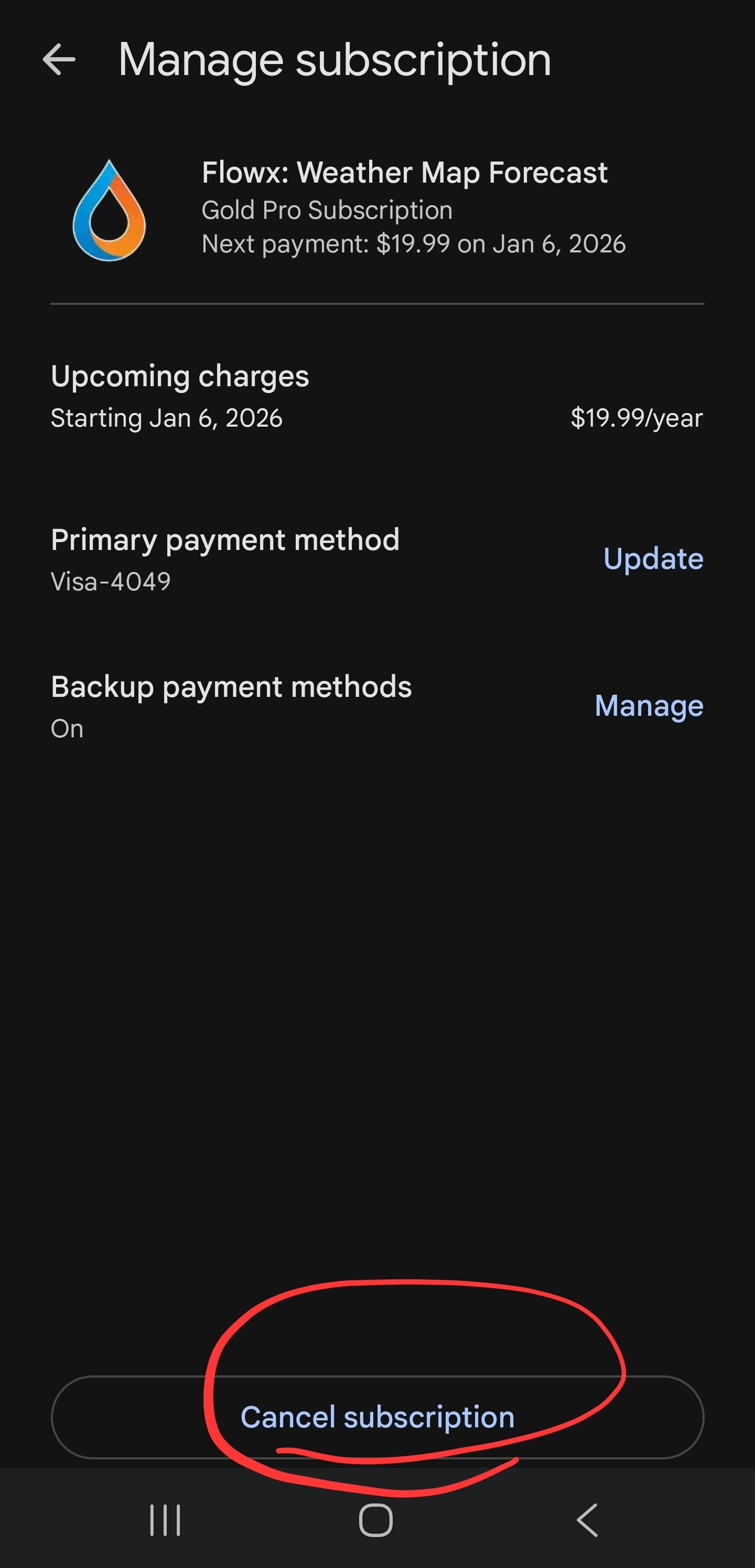
I’ve moved on to another weather app and canceled my years-long subscription to FlowX.
Regards, and I truly wish you success,
Speed
@Speed
A sincere and genuine thank you for the time that you have spent on this forum so far. It is sad to se a contributor to the forum decide to part from it.
And thanks for clearing out your points and the misunderstandings regarding your first
being sarcastic or not. I, like @duane, also assumed it was sarcastic, the first time I saw it.
I see and understand your points and your frustration.
It does however seam to me that your reaction is disproportionaly strong to the two triggers of it here, i.e. the change to flowx interface, and to Duanes response.
To me it seams that you are venting (dumping) frustration to Duane, that he is not responsible for:
It seams that you have built up frustration over time from your previous work, and that you are letting it out on Duane, and that is not nice. It is disrespectful.
It also seams that you view on, and you expectations on the relationship between yourself as an user of this app, and the developer is not completely sound.
I think that ass a user, even if we pay for pro subscription, we do not own the right to demand things to be one way or the other (as if we littery own the app). We are paying for the possibility of development, and we are contributing with our experience and input to help guide the direction of it.
It seam that your previous employer did own the application/implementation of the system that you where working on, and that did put them in a different position when it comes to what they could demand of you as a dev compared to what you can demand from a developer of an app where you are one of many users.
My point of view is that most app developers are not nearly as devoted to listening to users as Duane, and to even see a forum like this one is verry uncommon.
I do think that @duane have done a remarkable job with the implementation of this update, and that his considerations to the various possibilities are verry reasonable:
To @duane, I agree that you found a reasonable approach.
And I would like to thank you for the time that you have spent on this forum, on top on working on the app.
IDK why you are talking in plural here, it’s just one single app. And if you have issues with other apps, I don’t understand why you are venting here. It’s normal to stop paying for apps that don’t offer an added value.
I re-subscribed a couple of weeks ago because I find the cloud layers a useful feature.
This is one of the very few apps which actually improves year over year without worsening. The reason why I stopped using it was because I started to integrate data from DWD into a HTML-based app I have, which is better tailored for my needs, so I do know how hard it is to gather data from open sources, process, store, distribute and visualize it efficiently.
He’s a one man band who does the front- and backend (or at least he was) and it’s remarkable what he has archived, plus his vision about the direction into which the app evolves is one I like.
“I decide on what defaults are based on what I believe will value the most users.”: this is what I want. I don’t want to code nor design this app, I just want to have good access to weather data, and this app offers that.
My only wish would be a web version of it, because my desktop vs Android usage is at around 95% vs 5%.