I wanted to know how you felt about having a sort of thresholding feature in the graphs. For example, I care about dew point and want to know when it’ll be humid outside. But I don’t need to know the exact dew point, I’m only interested when the dew point is high, let’s say, above 18°C. Ideally then, in the graph I could set a threshold of 18 and see a red shaded area whenever that condition is met (and decide to now bike).
In fact, this reminds me of this post about notifications: Notify upon specific condition Set of conditions could be set up and when they are met, a shaded area appears on the graphs. Except that it would be simpler because it isn’t a notification and it isn’t model dependent. No need to worry about checking frequency or which model to use, just use the model that’s already selected in the graph.
Hope this all makes sense, happy to provide more thoughts.
I just thought of another example. I like the cloud cover data but find it cumbersome sometimes. My guess is I don’t check it often because I don’t notice the difference between 40 and 50% cloud cover. In a sense, there is an overload of information and I blank it out.
With thresholding, I can set a threshold of 50% and the app then only shows me when it’s “not cloudy” and when it is “cloudy”. It’s another way to simplify the information that I can see at a glance.
If plotting the dew point in the same graph as the temperature, then the limit can’t be used as it applies to both temperatures. Fixed Data Level and cloud lower limit can help but they don’t simplify the plot at all. Again, this idea is to simplify certain values when exact numbers aren’t needed.
Fundamentally, the thresholding that I’m taking about here is something that line, fill, or delta cannot provide.
So one way to display, sort of, what you want is to use more than one graph, and display temperature in one and dew point in the other. That way you can control the temperature range independently.
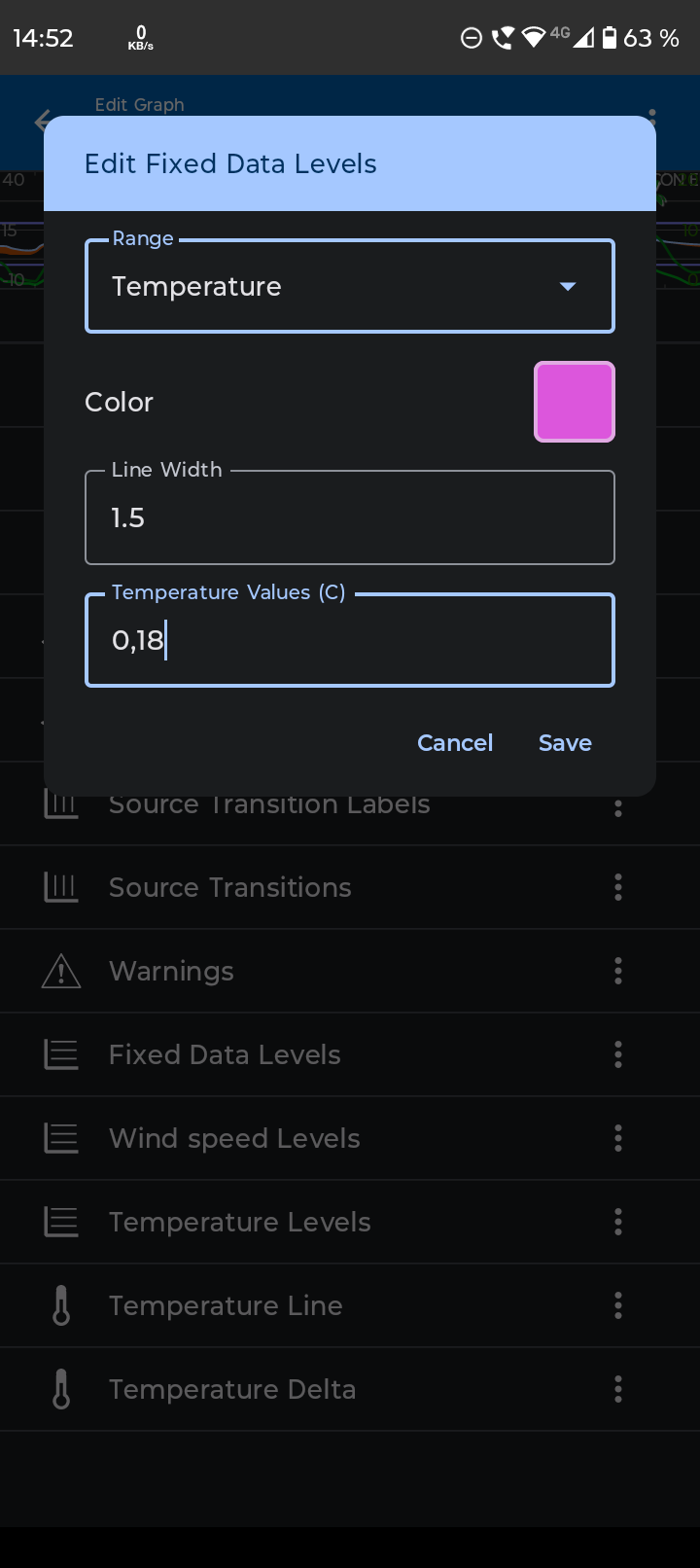
Another way, is to add “Fixed data levels”, see image below.
Edit it, select temperature, (that then renames it to “Temperature levels” (*) ), then add the values that you want to compare to, for example 0 and 18 C, separated by a comma.
(* @duane I’ve long thought that if you remove “Temperature levels”, it was not possible to add it back, and I was just about to report that this “bug” still persists, but I just discovered that it is called “Fixed data levels” and that it changes name depending on selected type of level. I get it now, but thought it was a bit confusing.)
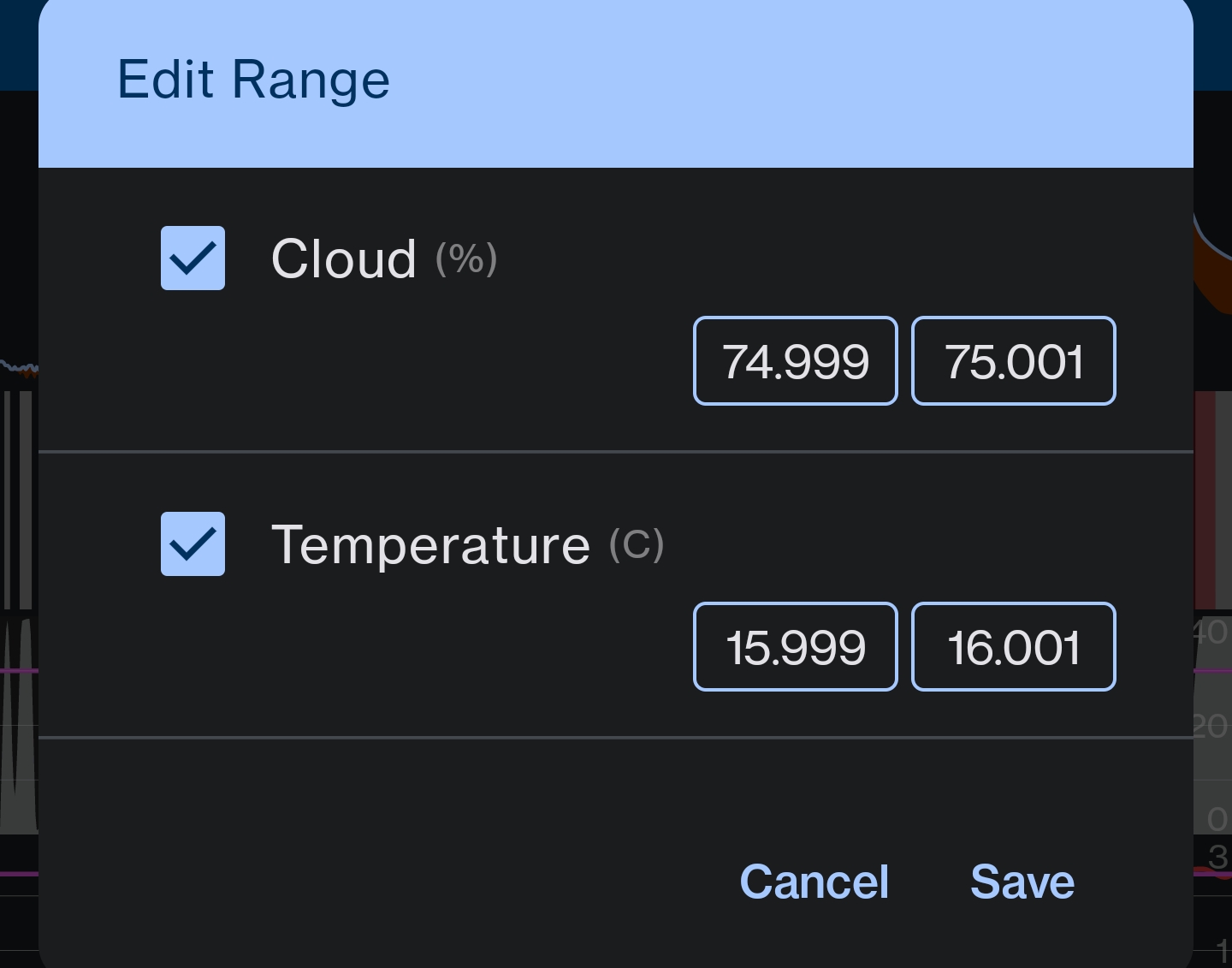
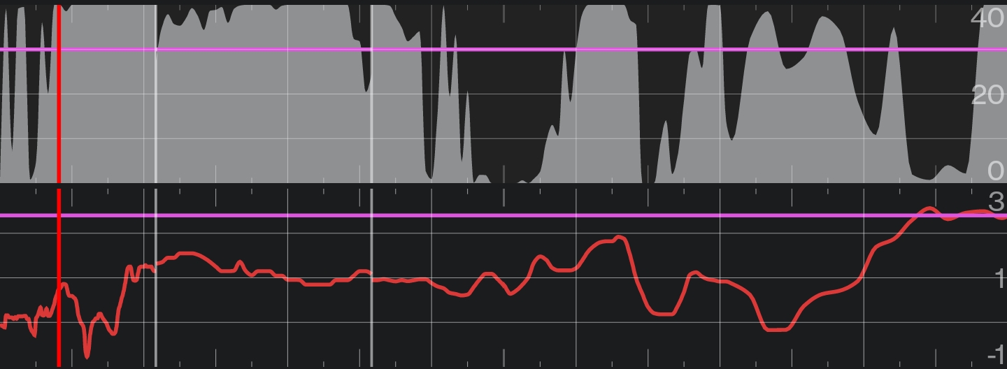
The comments about fixed data level made me try a sort of work around. If I set my values to fill, and then edit the ranges to be around a defined threshold (75% for clouds and 16°C for dew point):